TL;DR: To design a professional certificate, put the issuer's brand first, make the recipient's name the largest text, state exactly what was earned and when, add a signature and give the certificate a way to be verified. Word, Canva and PDF templates can look professional, but a file cannot prove it is genuine. TRUE Original designs each certificate in the issuer's own brand, can animate it and publishes it on the issuer's own domain, secured on a public blockchain so anyone can verify it in seconds.
A certificate is a trust document. An employer looks at it once and decides whether the course behind it was serious. A crowded layout, a pixelated logo or a name set in small grey type can undo weeks of training in that one look. A clean design with a working verification link does the opposite.
A professional certificate is built around six elements: the issuer's brand, the recipient's full name, a precise description of the achievement, a signature, a verification method and a clean visual hierarchy. Everything else is decoration. The order matters as much as the elements, because the eye should travel from issuer to recipient to achievement to date to verification.
The issuer's identity should be the first thing anyone sees: a high-resolution logo that is neither stretched nor pixelated, the brand colours and the organization's name. A certificate borrows its authority from whoever stands behind it. If a reader cannot tell within a second who issued it, the certificate has lost most of its weight.
Many certificates bury the recipient's name in small type below a block of text. The name should be the largest text on the page after the title. It is their achievement. The layout should say so.
"Certificate of Completion" is vague. "Certificate of Completion: Advanced Project Management, 40 Hours" tells the reader exactly what the credential represents.
Include:
A certificate without a signature looks unfinished. A digital or scanned signature from the programme director, the CEO or the head of training puts a named person next to the logo. People trust a name they could call.
A verification method, such as a QR code, a unique URL or a verification number, lets anyone confirm the certificate is authentic without contacting the issuer. Without one, a certificate is only as trustworthy as the pixels it is made of. A PDF can be edited in a minute.
Resist the urge to fill every inch. A professional certificate has breathing room, and the eye moves in one direction: issuer → recipient → achievement → date → verification. If the page feels crowded, remove something.
Certificate template designs fall into four common styles: classic formal, modern minimal, bold branded and digital animated. The styles differ in layout, ornament and typography, and in one thing that matters more than looks: whether the certificate can prove it is genuine. Classic, minimal and branded templates can all look professional on paper, while a digital animated certificate such as a TRUE Original document adds motion, a verification link and a home on the issuer's own domain.
| Style | Layout | Visual elements | Professional appearance | Typical use |
|---|---|---|---|---|
| Classic formal | Horizontal, centred, symmetrical | Ornate border, seal or ribbon, serif or script type | Ceremonial and traditional; looks dated when the border fights the text | Diplomas, academic awards |
| Modern minimal | Horizontal or vertical, wide margins, often left-aligned | One or two sans-serif typefaces, one accent colour, a small logo | Clean and current; looks generic without the issuer's brand | Corporate training, tech courses |
| Bold branded | Blocks of brand colour, a large logo, a strong grid | The brand palette, a photo or pattern, the issuer's own typeface | Recognisable at a glance; the recipient's name must still lead | Course providers, events, awards recipients share |
| Digital animated (TRUE Original) | Horizontal or vertical, one page or several, with badges | The issuer's brand in motion, a QR code and a verification link | Looks like the issuer's own product, opens on the issuer's own domain and verifies in seconds | Diplomas, certificates, licences and memberships shared on LinkedIn and checked by employers |
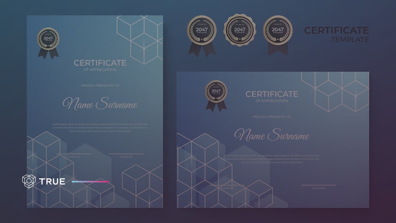
The image at the top of this page shows one certificate of appreciation in two layouts. Vertical suits a document that reads like a letter, such as a transcript or a certificate of employment. Horizontal suits a diploma or an award that will be framed or shown on a screen. Real certificates designed for KTH Executive School, Karolinska Institutet and EY Entrepreneur of The Year are in TRUE Original's diploma design templates.
The common tools for certificate templates are word processors such as Word and Google Docs, graphic design tools such as Canva, and PDF certificate generators. All three can produce a good-looking certificate. All three produce a file, and a file can be copied, edited and forwarded without the issuer ever knowing.
Pros: everyone has access, editing is easy and it costs little or nothing.
Cons: no verification and no security. The recipient, or anyone else, can open the file and change the name, the date or the achievement. It looks like what it is: a document with a border.
Pros: polished templates, drag-and-drop design and professional-looking output.
Cons: the result is a static image or PDF, with no verification and no analytics. Looking great is also what makes a convincing forgery.
Pros: batch issuing, some branding options and printable output.
Cons: a PDF can be edited. Adobe Acrobat, Preview and free online editors change text, dates and names in minutes, and an unsigned PDF carries no record that it was altered.
Every static template produces a file. Once a certificate leaves as an email attachment, the issuer loses sight of it: whether it was altered, whether it was shared, even whether it was opened. For internal recognition that may be acceptable. When employers rely on a certificate, when regulators inspect it and when the issuer's reputation rides on it, a static file is a risk. The comparison of paper, PDF and TRUE Original documents goes through the trade-offs format by format.
The best practices for certificate template design are one clear hierarchy, at most two typefaces, text contrast of at least 4.5:1 as WCAG 2.2 requires for normal text, a vector logo, precise wording and a verification method on every certificate. A template built this way stays legible on a phone, in print and in a LinkedIn preview.
Pick one typeface for the recipient's name and one for everything else. A script face can carry the name in a classic design. In body text it slows the reader down. Let size, not colour, carry the order.
The Web Content Accessibility Guidelines (WCAG) 2.2, a W3C Recommendation since 12 December 2024, set the bar for legible text. Success criterion 1.4.3 (Level AA) reads: "The visual presentation of text and images of text has a contrast ratio of at least 4.5:1". Large text, which WCAG defines as at least 18 point or 14 point bold, needs 3:1. Logos are exempt. In the words of WCAG 2.2: "Text that is part of a logo or brand name has no contrast requirement." Pale grey on cream is the combination to test first.
Choose horizontal or vertical and keep it across a programme. Every certificate the issuer sends should look like part of the same family, from the first participation certificate to the final diploma.
Use the logo as an SVG or a high-resolution PNG. A logo that looks sharp on screen can still print soft. The fix is a better source file.
Write the title as the achievement, not the category. "Certificate of Participation: Annual Safety Conference, 2 days" tells an employer more than "Certificate". Use the recipient's name as registered, and write the date so nobody can misread it: 2 October 2026, not 02/10/26.
The QR code or verification URL belongs on the certificate, not in a separate email. Anyone can check a TRUE Original document for free in TRUE Verify, without an account, by pasting its link, its document ID or the PDF.
The most common certificate design mistakes are too much text, low-resolution logos, no verification method, sending the certificate as an editable Word file or a low-quality PDF, no expiry date on time-limited credentials and an unbranded generic template. Each one makes the credential look less serious than the achievement behind it. The missing verification method costs the most, because it makes a forgery and a genuine certificate look the same.
A certificate is not a transcript. Paragraphs of course description, terms and conditions or legal disclaimers belong in supporting documents. Keep the certificate to who, what, when and verified by whom.
A blurry or pixelated logo makes a certificate look amateur faster than anything else on the page. Use vector formats (SVG) or high-resolution PNGs. If the logo looks fine on screen but prints poorly, get a better source file.
Without a QR code, a verification URL or a unique credential ID, an employer, client or regulator cannot confirm that a certificate is genuine. They are asked to take it on faith. Forged paperwork is common. According to ACFE's Occupational Fraud 2026: A Report to the Nations, creating fraudulent physical documents was the most common way fraudsters concealed their schemes, in 39% of the cases studied. Altering physical documents came next at 33%, and electronic documents or files were created or altered in 28% of the cases.
A certificate that arrives as a .docx file can be edited by the recipient. One that arrives as a low-quality PDF looks like a receipt. The format signals how seriously the issuer takes the achievement.
Some credentials expire: first aid, food safety, compliance training, professional licences. A certificate with no expiry date and no way to check current validity lets someone present an expired credential as current, and nobody can tell from the page.
An unmodified template from a free design tool is the certificate version of a form letter. It tells the recipient that the issuer did not invest in the credential, which gives the recipient little reason to value it. A certificate should be unmistakably the issuer's.
Four sources can validate certificate design best practices and common mistakes: W3C's WCAG 2.2 for legibility and contrast, W3C's Verifiable Credentials Data Model 2.0 for credentials that software can verify, ACFE's Report to the Nations for how documents get forged, and the issuer's own verification page for whether one specific certificate is genuine. The same four apply to experience certificates and participation certificates designed online as much as to diplomas.
Whether a programme should issue a certificate, a diploma or a badge in the first place is a separate decision, covered in certificate vs diploma vs badge.
TRUE Original designs every certificate in the issuer's own brand: logo, colours, typefaces and layout, horizontal or vertical, on one page or several, with badges if the programme uses them. A TRUE Original document can be animated. It lives as a link on the issuer's own domain, not on TRUE's. Each document is secured on a public blockchain (TRUE Original uses several, among them Ethereum and Polygon), so anyone can verify it from its QR code.
KTH Executive School, Karolinska Institutet and EY Entrepreneur of The Year issue their certificates, diplomas and awards with TRUE. Their designs are in the diploma design templates gallery, and each one looks like its issuer.
A TRUE Original document can be animated in the issuer's design, which a static PDF or a printed template cannot do. The certificate opens as a page, on a phone or a desktop, and the layout adapts to the screen.
Each TRUE Original document is a permanent link on the issuer's own domain. An employer who opens it sees the issuer's brand and the issuer's URL. Every share on LinkedIn sends traffic to the issuer.
When TRUE Original issues a document, its record is written to a public blockchain, and the document cannot be altered after issue. An employer scans the QR code with a phone camera and sees who issued it, to whom, when and for what. No app. No email to the issuer.
A TRUE Original document is a link. The recipient adds it to LinkedIn, a portfolio or an email signature, and the issuer sees in the dashboard when it is opened and shared. The guide on adding a digital certificate to LinkedIn shows the recipient's side.
Great certificate design in practice is a certificate that recipients want to share and employers can check. Four organizations that issue TRUE Original documents describe it in their own words.
AW Academy, a tech reskilling programme, issues digital diplomas to graduates entering the job market. Sissel Gade, Head of Operations at AW Academy, said: "Our alumni now have nice looking Diplomas in an accessible format, but we also see great marketing value!" Each graduate who posts a diploma on LinkedIn shows AW Academy's brand to hiring managers.
Sitevision, a Swedish web platform company, issues animated certificates. Jessica Adolfsson, Customer Success Manager at Sitevision: "The animation looks fantastic, and it's so simple for our recipients."
Skanska's Learning & Development team issues digital certificates for internal training. Tania Sjöberg of Skanska L&D wrote: "This is absolutely brilliant! A thousand thank you's!!"
Södertälje Kommun gave blockchain-secured diplomas to the winners of HACK FOR SÖDERTÄLJE. Anthony Mccarrick, Digitization Strategist at Södertälje Kommun, summed it up: "Amazing. I tip my hat for your design TRUE!"
A certificate design is ready to issue when it passes seven checks, from verification and branding to tamper-proofing and expiry. Three noes or more, and the programme has gaps that layout alone cannot fix.
Moving from a certificate template to a platform such as TRUE Original changes what happens after a certificate is issued, not the design work before it. The issuer still designs the certificate and still issues in bulk, through a dashboard or an API instead of a mail merge. The certificate can no longer be edited, and a QR code answers the verification calls.
The design gets more room. Animation, interactivity and layouts that adapt to the screen are things a static PDF cannot carry, and the certificate stays on the issuer's own domain. To see what that looks like for a specific programme, book a demo.
TRUE Original has issued over 900,000 documents for more than 200 issuers in over 15 countries. Recipients sharing those documents have generated over 100 million marketing impressions.
Every organisation we work with started with the same question. Give us thirty minutes and we will show you what your own documents would be worth.
Book a callNot sure where to start? Let us help!

Trusted by leading organisations worldwide